Embed Size (px)
Citation preview
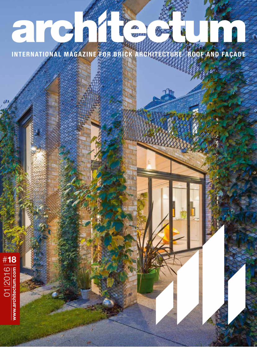
INTERNATIONAL MAGAZINE FOR BRICK ARCHITECTURE ROOF AND FAÇADE
01 2
016
ww
w.a
rchi
tect
um.c
om
#18
26
EDITOR Wienerberger AG, 1100 Wien PUBLISHING HOUSE Österreichischer Wirtschaftsverlag GmbH, 1120 Wien
CHIEF EDITORSHIP Andrea Blama (Wienerberger AG) CO-OPERATION Tom Dearden (UK), Susanne Gorny (AT), Susanne Karr (AT),
Sabine Merlevede (BE), Arnaud Mounier (FR), Bianca Murphy (DE), Pavla Peterkova (CZ), Martin Schröder (NL), Alexa Uplegger (GER)
GRAPHICS AND DESIGN Simon Jappel (Österreichischer Wirtschaftsverlag) PRINTING Stiepan & Partner Druck GmbH,
Hirtenbergerstraße 31, 2544 Leobersdorf PRODUCTION Ueberreuter Druckzentrum GmbH
WIENERBERGER AG
CLAY BUILDING MATERIALS EUROPE
A-1100 Wien, Wienerberg City
Wienerbergstraße 11
T +43 (1) 601 92-10551
www.clay-wienerberger.com
twitter.com/architectum
youtube.com/wienerbergerofficial
IMPRINT
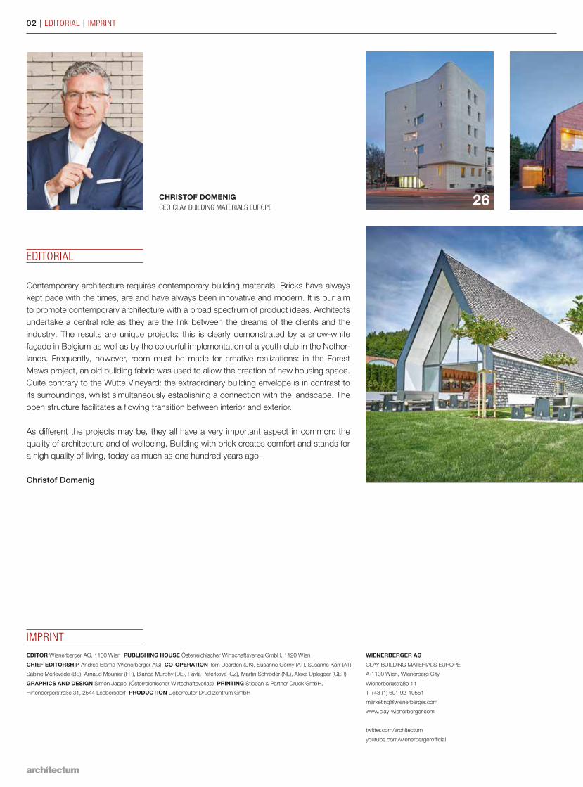
Contemporary architecture requires contemporary building materials. Bricks have always kept pace with the times, are and have always been innovative and modern. It is our aim to promote contemporary architecture with a broad spectrum of product ideas. Architects undertake a central role as they are the link between the dreams of the clients and the industry. The results are unique projects: this is clearly demonstrated by a snow-white façade in Belgium as well as by the colourful implementation of a youth club in the Nether-lands. Frequently, however, room must be made for creative realizations: in the Forest Mews project, an old building fabric was used to allow the creation of new housing space. Quite contrary to the Wutte Vineyard: the extraordinary building envelope is in contrast to its surroundings, whilst simultaneously establishing a connection with the landscape. The open structure facilitates a flowing transition between interior and exterior.
As different the projects may be, they all have a very important aspect in common: the quality of architecture and of wellbeing. Building with brick creates comfort and stands for a high quality of living, today as much as one hundred years ago.
Christof Domenig
CHRISTOF DOMENIGCEO CLAY BUILDING MATERIALS EUROPE
EDITORIAL
02 | EDITORIAL | IMPRINT
24
20
3408 18
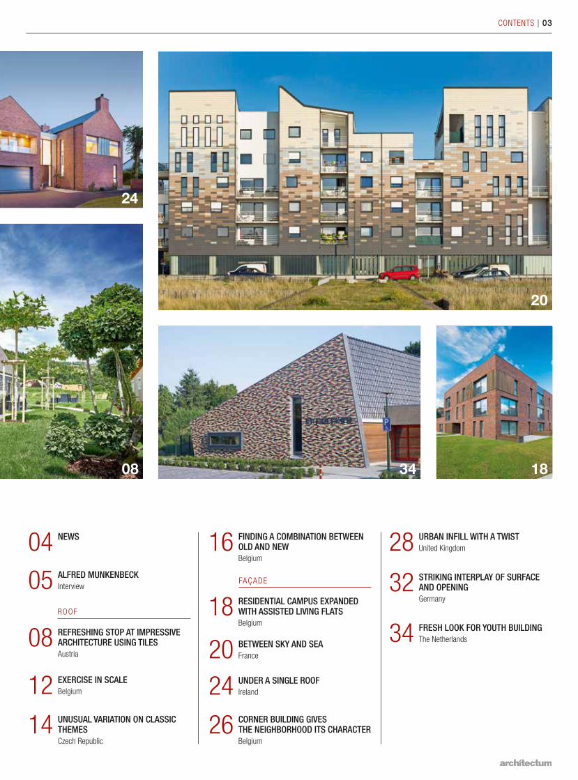
NEWS04
REFRESHING STOP AT IMPRESSIVE ARCHITECTURE USING TILESAustria
08
RESIDENTIAL CAMPUS EXPANDED WITH ASSISTED LIVING FLATSBelgium
18STRIKING INTERPLAY OF SURFACE AND OPENINGGermany
32
BETWEEN SKY AND SEAFrance20
URBAN INFILL WITH A TWISTUnited Kingdom28
UNDER A SINGLE ROOFIreland24CORNER BUILDING GIVES THE NEIGHBORHOOD ITS CHARACTERBelgium
26
FRESH LOOK FOR YOUTH BUILDINGThe Netherlands34
ALFRED MUNKENBECKInterview05
EXERCISE IN SCALEBelgium12UNUSUAL VARIATION ON CLASSIC THEMESCzech Republic
14
FINDING A COMBINATION BETWEEN OLD AND NEWBelgium
16
ROOF
FAÇADE
CONTENTS | 03
04 | NEWS | NEW PRODUCTS
WIENERBERGER UK`S E4 BRICK HOUSE™ WINS HOUSING INNOVATION AWARD
The Housing Innovation Award in the UK celebrates the pioneering spirit of the housing sector and highlights examples of inventive schemes and services. Wienerberger UK was
proud to win this award, seeing it as great recognition to be on the right path and as a fantastic reward for everyone who has been involved in the development of the project
over the past three years. The Wienerberger e4 brick house™ was developed to address the need for affordable, sustainable housing in the UK. Designed in conjunction with
global engineering and design consultancy, ARUP, the e4 brick house™ model focuses on the four pillars of Wienerberger’s global e4 concept – energy, economy, environment and emotion. It utilizes a fabric first approach using a clay building envelope to deliver a
house with reduced energy needs, meaning lower running costs for the occupier. Annette Forster, Director of Marketing commented: “We are really pleased that the Wienerberger
e4 brick house™ won the award for Most Innovative New Product at the Housing Innova-tion Awards. Our e4 brick house is about building better homes and using new and more
efficient ways to achieve this.” www.wienerberger.co.uk
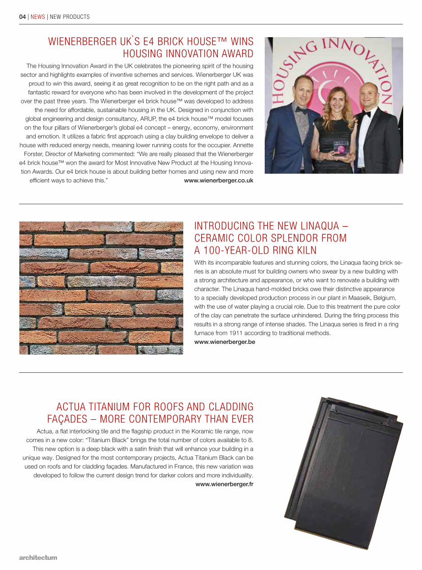
ACTUA TITANIUM FOR ROOFS AND CLADDING FAÇADES – MORE CONTEMPORARY THAN EVER
Actua, a flat interlocking tile and the flagship product in the Koramic tile range, now comes in a new color: “Titanium Black” brings the total number of colors available to 8.
This new option is a deep black with a satin finish that will enhance your building in a unique way. Designed for the most contemporary projects, Actua Titanium Black can be used on roofs and for cladding façades. Manufactured in France, this new variation was
developed to follow the current design trend for darker colors and more individuality.www.wienerberger.fr
INTRODUCING THE NEW LINAQUA – CERAMIC COLOR SPLENDOR FROM A 100-YEAR-OLD RING KILNWith its incomparable features and stunning colors, the Linaqua facing brick se-ries is an absolute must for building owners who swear by a new building with a strong architecture and appearance, or who want to renovate a building with character. The Linaqua hand-molded bricks owe their distinctive appearance to a specially developed production process in our plant in Maaseik, Belgium, with the use of water playing a crucial role. Due to this treatment the pure color of the clay can penetrate the surface unhindered. During the firing process this results in a strong range of intense shades. The Linaqua series is fired in a ring furnace from 1911 according to traditional methods. www.wienerberger.be
Thom
as D
usek
ALFRED MUNKENBECK | INTERVIEW | 05
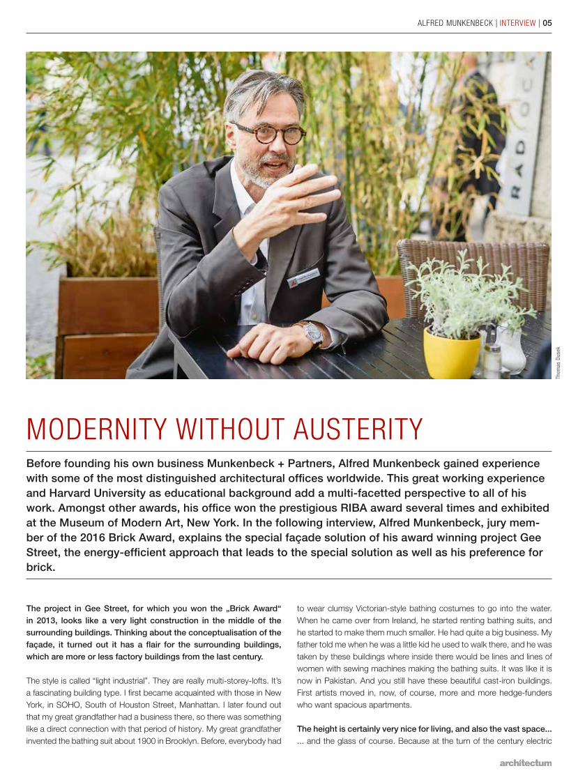
The project in Gee Street, for which you won the „Brick Award“ in 2013, looks like a very light construction in the middle of the surrounding buildings. Thinking about the conceptualisation of the façade, it turned out it has a flair for the surrounding buildings, which are more or less factory buildings from the last century.
The style is called “light industrial”. They are really multi-storey-lofts. It’s a fascinating building type. I first became acquainted with those in New York, in SOHO, South of Houston Street, Manhattan. I later found out that my great grandfather had a business there, so there was something like a direct connection with that period of history. My great grandfather invented the bathing suit about 1900 in Brooklyn. Before, everybody had
to wear clumsy Victorian-style bathing costumes to go into the water. When he came over from Ireland, he started renting bathing suits, and he started to make them much smaller. He had quite a big business. My father told me when he was a little kid he used to walk there, and he was taken by these buildings where inside there would be lines and lines of women with sewing machines making the bathing suits. It was like it is now in Pakistan. And you still have these beautiful cast-iron buildings. First artists moved in, now, of course, more and more hedge-funders who want spacious apartments.
The height is certainly very nice for living, and also the vast space...... and the glass of course. Because at the turn of the century electric
MODERNITY WITHOUT AUSTERITYBefore founding his own business Munkenbeck + Partners, Alfred Munkenbeck gained experience with some of the most distinguished architectural offices worldwide. This great working experience and Harvard University as educational background add a multi-facetted perspective to all of his work. Amongst other awards, his office won the prestigious RIBA award several times and exhibited at the Museum of Modern Art, New York. In the following interview, Alfred Munkenbeck, jury mem-ber of the 2016 Brick Award, explains the special façade solution of his award winning project Gee Street, the energy-efficient approach that leads to the special solution as well as his preference for brick.
06 | INTERVIEW | ALFRED MUNKENBECK
light was barely existent, everybody had gas light. So people who had factories tried to put as much natural light as possible. So these places have huge areas of glazing and the very thin ornate cast-iron façades.
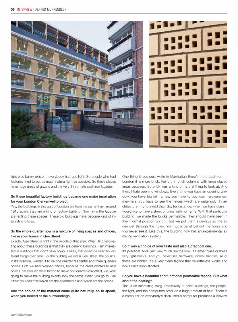
So these beautiful factory buildings became one major inspiration for your London Clerkenwell project.Yes, the buildings in this part of London are from the same time, around 1910 again, they are a kind of factory building. Now firms like Google are renting these spaces. These old buildings have become kind of in-teresting offices.
So the whole quarter now is a mixture of living spaces and offices, like in your house in Gee Street.Exactly. Gee Street is right in the middle of that area. What I find fascina-ting about these buildings is that they are generic buildings. I am interes-ted in buildings that don’t have obvious uses, that could be used for dif-ferent things over time. For the building we did in Gee Street, the council, in it‘s wisdom, wanted it to be one quarter residential and three quarters offices. First we had planned offices, because the client wanted to rent offices. So after we were forced to make one quarter residential, we were going to make the building exactly look the same. When you go to Gee Street you can’t tell which are the apartments and which are the offices.
And the choice of the material came quite naturally, so to speak, when you looked at the surroundings.
One thing is obvious: while in Manhattan there’s more cast-iron, in London it is more brick. Fairly thin brick columns with large glazed areas between. So brick was a kind of natural thing to look at. And then, I hate opening windows. Every time you have an opening win-dow, you have big fat frames, you have to put your hardware so-mewhere, you have to see the hinges which are quite ugly. In ar-chitecture I try to avoid that. So, for instance, when we have glass, I would like to have a sheet of glass with no frame. With that particular building, we made the bricks permeable. They should have been in their normal position upright, but we put them sideways so the air can get through the holes. You got a panel behind the holes and you never see it. Like this, the building now has an experimental air mixing ventilation system.
So it was a choice of your taste and also a practical one.It’s practical. And I just very much like the look. It’s either glass or these very light bricks. And you never see hardware, doors, handles, all of these are hidden. It’s a very clean façade that nevertheless works and looks quite sophisticated.
So you have a beautiful and functional permeable façade. But what about the heating? This is an interesting thing. Particularly in office buildings, the people, the light, and the computers produce a huge amount of heat. There is a computer on everybody’s desk. And a computer produces a kilowatt
Den
nis
Gilb
ert
ALFRED MUNKENBECK | INTERVIEW | 07
of heat. So if you have twenty computers in a room, you have twenty kilowatts of heat. It’s like having five or six blow-heaters blowing. Full power all the time. You get much too much heat in an office. So if you have a well insulated office, you don’t need any heating until the outside temperature is below zero. Here we need a little bit of heat for one week of the year. The planners didn’t understand the concept at first, they wanted to provide district heating. But we said: ours is going to be a very green building, it’s going to be so green, we don’t want your heating at all. They really had lots of trouble with that.
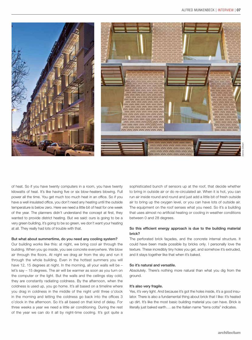
But what about summertime, do you need any cooling system?Our building works like this: at night, we bring cool air through the building. When you go inside, you see concrete everywhere. We blow air through the floors. At night we drag air from the sky and run it through the whole building. Even in the hottest summers you will have 12, 15 degrees at night. In the morning, all your walls will be – let’s say – 15 degrees. The air will be warmer as soon as you turn on the computer or the light. But the walls and the ceilings stay cold, they are constantly radiating coldness. By the afternoon, when the coldness is used up, you go home. It’s all based on a timeline where you drag in coldness in the middle of the night until three o’clock in the morning and letting the coldness go back into the offices 3 o’clock in the afternoon. So it’s all based on that kind of delay. For three weeks a year we need a little air conditioning. During the rest of the year we can do it all by night-time cooling. It’s got quite a
sophisticated bunch of sensors up at the roof, that decide whether to bring in outside air or do re-circulated air. When it is hot, you can run air inside round and round and just add a little bit of fresh outside air to bring up the oxygen level, or you can have lots of outside air. The equipment on the roof senses what you need. So it’s a building that uses almost no artificial heating or cooling in weather conditions between 0 and 28 degrees.
So this efficient energy approach is due to the building material brick?The perforated brick façades, and the concrete internal structure. It could have been made possible by bricks only. I personally love the texture. These incredibly tiny holes you get, and somehow it’s extruded, and it stays together like that when it’s baked.
So it’s natural and versatile.Absolutely. There’s nothing more natural than what you dig from the ground.
It’s also very fragile.Yes, it’s very light. And because it’s got the holes inside, it’s a good insu-lator. There is also a fundamental thing about brick that I like: it’s heated up dirt. It’s like the most basic building material you can have. Brick is literally just baked earth…. as the Italian name “terra cotta” indicates.
08 | ROOF | AUSTRIA
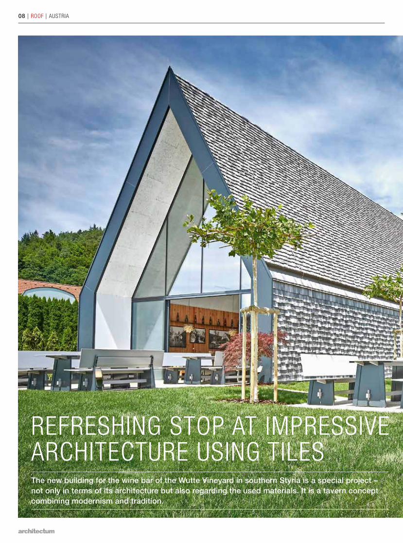
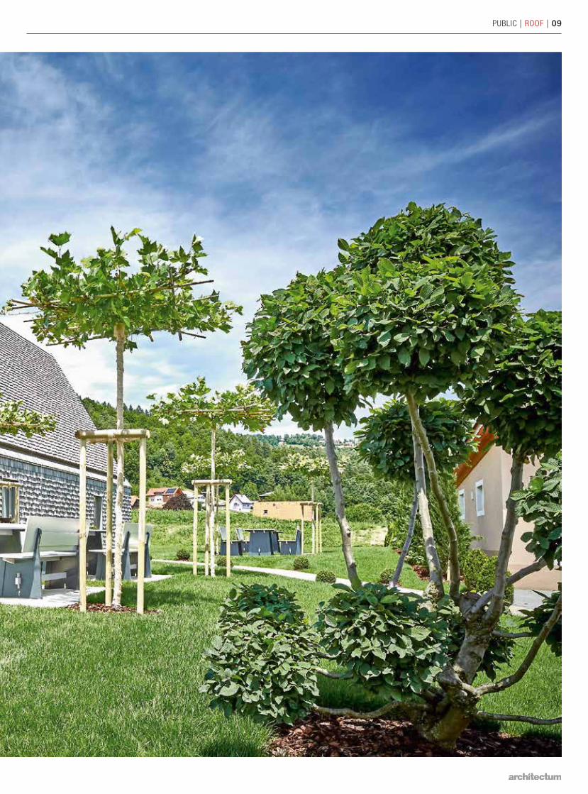
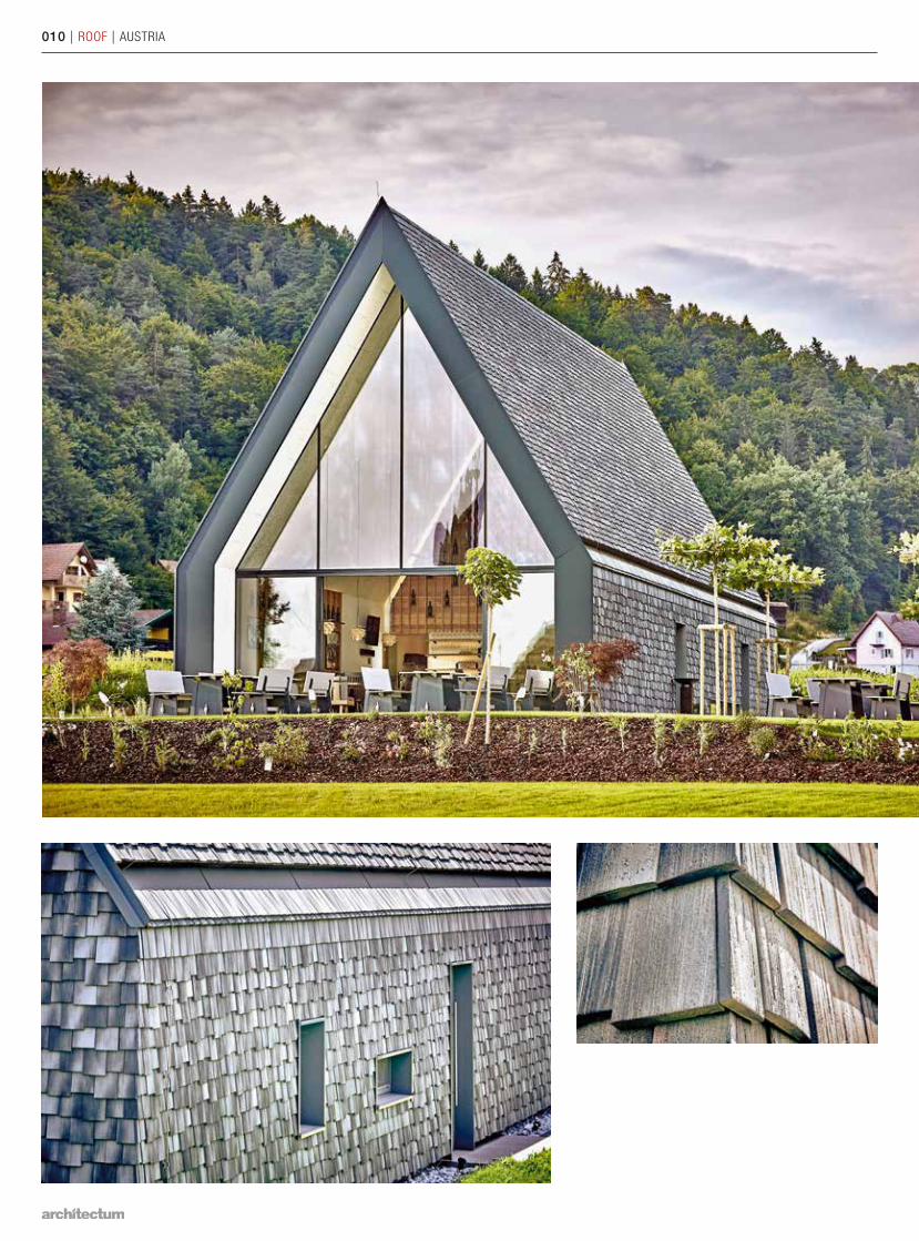
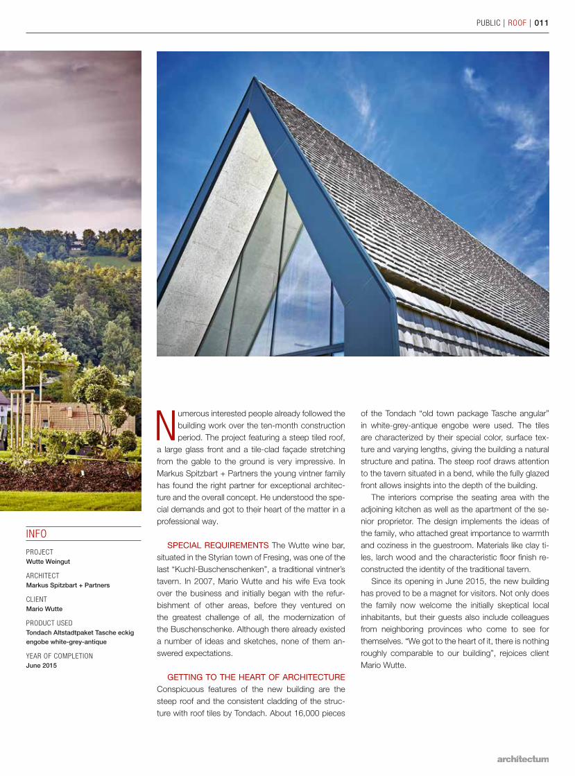
REFRESHING STOP AT IMPRESSIVE ARCHITECTURE USING TILESThe new building for the wine bar of the Wutte Vineyard in southern Styria is a special project – not only in terms of its architecture but also regarding the used materials. It is a tavern concept combining modernism and tradition.
PUBLIC | ROOF | 09
010 | ROOF | AUSTRIA
INFO
PROJECT Wutte Weingut
ARCHITECTMarkus Spitzbart + Partners
CLIENTMario Wutte
PRODUCT USEDTondach Altstadtpaket Tasche eckig engobe white-grey-antique
YEAR OF COMPLETIONJune 2015
PUBLIC | ROOF | 011
Numerous interested people already followed the building work over the ten-month construction period. The project featuring a steep tiled roof,
a large glass front and a tile-clad façade stretching from the gable to the ground is very impressive. In Markus Spitzbart + Partners the young vintner family has found the right partner for exceptional architec-ture and the overall concept. He understood the spe-cial demands and got to their heart of the matter in a professional way.
SPECIAL REQUIREMENTS The Wutte wine bar, situated in the Styrian town of Fresing, was one of the last “Kuchl-Buschenschenken”, a traditional vintner’s tavern. In 2007, Mario Wutte and his wife Eva took over the business and initially began with the refur-bishment of other areas, before they ventured on the greatest challenge of all, the modernization of the Buschenschenke. Although there already existed a number of ideas and sketches, none of them an-swered expectations.
GETTING TO THE HEART OF ARCHITECTURE Conspicuous features of the new building are the steep roof and the consistent cladding of the struc-ture with roof tiles by Tondach. About 16,000 pieces
of the Tondach “old town package Tasche angular” in white-grey-antique engobe were used. The tiles are characterized by their special color, surface tex-ture and varying lengths, giving the building a natural structure and patina. The steep roof draws attention to the tavern situated in a bend, while the fully glazed front allows insights into the depth of the building.
The interiors comprise the seating area with the adjoining kitchen as well as the apartment of the se-nior proprietor. The design implements the ideas of the family, who attached great importance to warmth and coziness in the guestroom. Materials like clay ti-les, larch wood and the characteristic floor finish re-constructed the identity of the traditional tavern.
Since its opening in June 2015, the new building has proved to be a magnet for visitors. Not only does the family now welcome the initially skeptical local inhabitants, but their guests also include colleagues from neighboring provinces who come to see for themselves. “We got to the heart of it, there is nothing roughly comparable to our building”, rejoices client Mario Wutte.
012 | ROOF | BELGIUM
PUBLIC | ROOF | 013
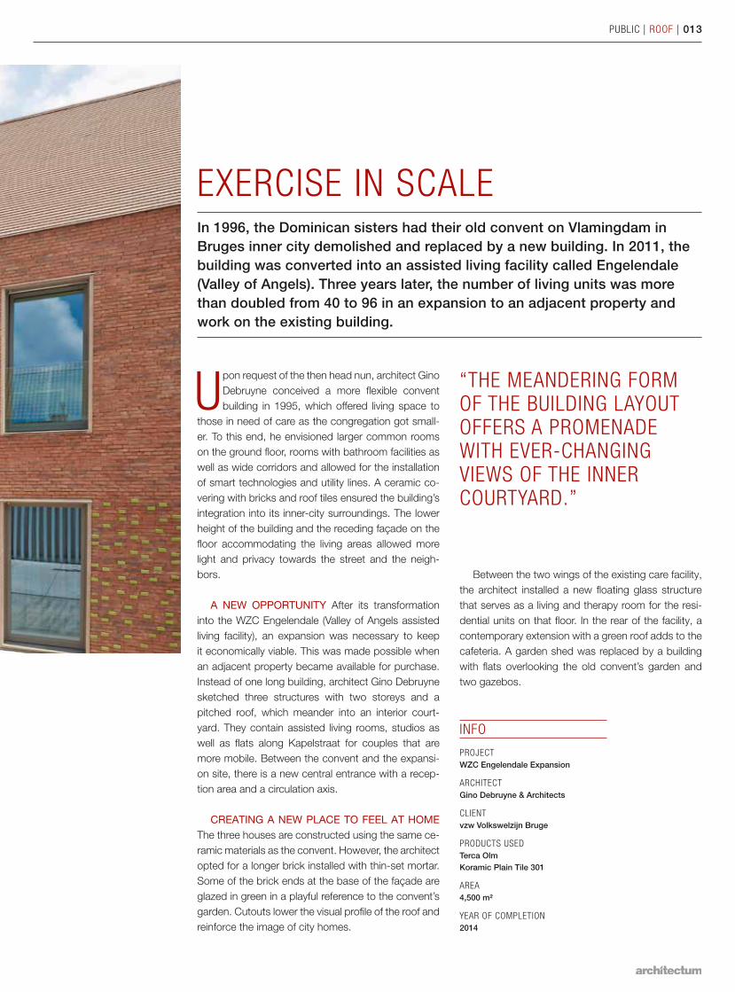
EXERCISE IN SCALEIn 1996, the Dominican sisters had their old convent on Vlamingdam in Bruges inner city demolished and replaced by a new building. In 2011, the building was converted into an assisted living facility called Engelendale (Valley of Angels). Three years later, the number of living units was more than doubled from 40 to 96 in an expansion to an adjacent property and work on the existing building.
Upon request of the then head nun, architect Gino Debruyne conceived a more flexible convent building in 1995, which offered living space to
those in need of care as the congregation got small-er. To this end, he envisioned larger common rooms on the ground floor, rooms with bathroom facilities as well as wide corridors and allowed for the installation of smart technologies and utility lines. A ceramic co-vering with bricks and roof tiles ensured the building’s integration into its inner-city surroundings. The lower height of the building and the receding façade on the floor accommodating the living areas allowed more light and privacy towards the street and the neigh-bors.
A NEW OPPORTUNITY After its transformation into the WZC Engelendale (Valley of Angels assisted living facility), an expansion was necessary to keep it economically viable. This was made possible when an adjacent property became available for purchase. Instead of one long building, architect Gino Debruyne sketched three structures with two storeys and a pitched roof, which meander into an interior court-yard. They contain assisted living rooms, studios as well as flats along Kapelstraat for couples that are more mobile. Between the convent and the expansi-on site, there is a new central entrance with a recep-tion area and a circulation axis.
CREATING A NEW PLACE TO FEEL AT HOME The three houses are constructed using the same ce-ramic materials as the convent. However, the architect opted for a longer brick installed with thin-set mortar. Some of the brick ends at the base of the façade are glazed in green in a playful reference to the convent’s garden. Cutouts lower the visual profile of the roof and reinforce the image of city homes.
INFO
PROJECT WZC Engelendale Expansion
ARCHITECTGino Debruyne & Architects
CLIENTvzw Volkswelzijn Bruge
PRODUCTS USEDTerca Olm Koramic Plain Tile 301
AREA4,500 m²
YEAR OF COMPLETION2014
“THE MEANDERING FORM OF THE BUILDING LAYOUT OFFERS A PROMENADE WITH EVER-CHANGING VIEWS OF THE INNER COURTYARD.”
Between the two wings of the existing care facility, the architect installed a new floating glass structure that serves as a living and therapy room for the resi-dential units on that floor. In the rear of the facility, a contemporary extension with a green roof adds to the cafeteria. A garden shed was replaced by a building with flats overlooking the old convent’s garden and two gazebos.
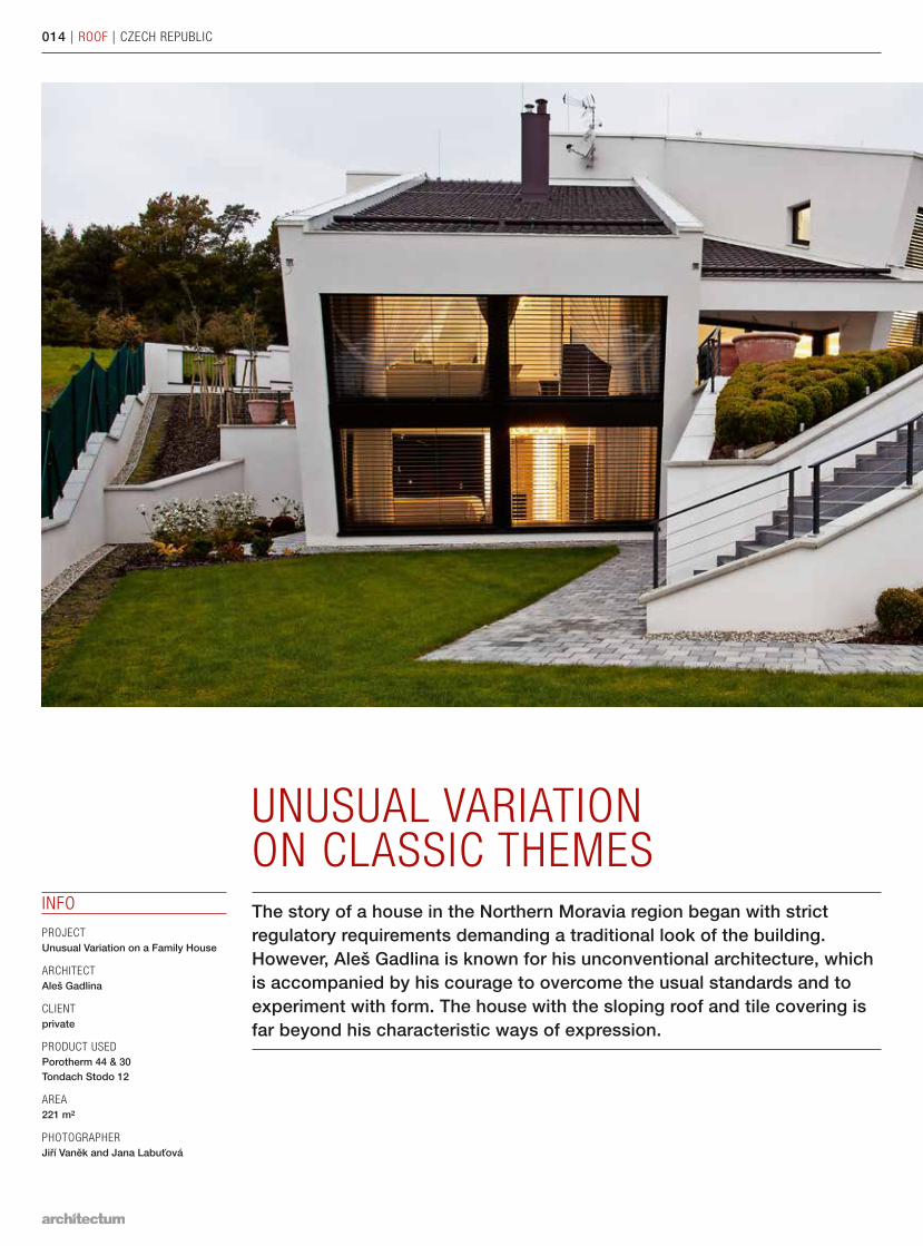
UNUSUAL VARIATION ON CLASSIC THEMESThe story of a house in the Northern Moravia region began with strict regulatory requirements demanding a traditional look of the building. However, Aleš Gadlina is known for his unconventional architecture, which is accompanied by his courage to overcome the usual standards and to experiment with form. The house with the sloping roof and tile covering is far beyond his characteristic ways of expression.
014 | ROOF | CZECH REPUBLIC
INFO
PROJECT Unusual Variation on a Family House
ARCHITECTAleš Gadlina
CLIENTprivate
PRODUCT USEDPorotherm 44 & 30 Tondach Stodo 12
AREA221 m²
PHOTOGRAPHERJiří Vaněk and Jana Labuťová
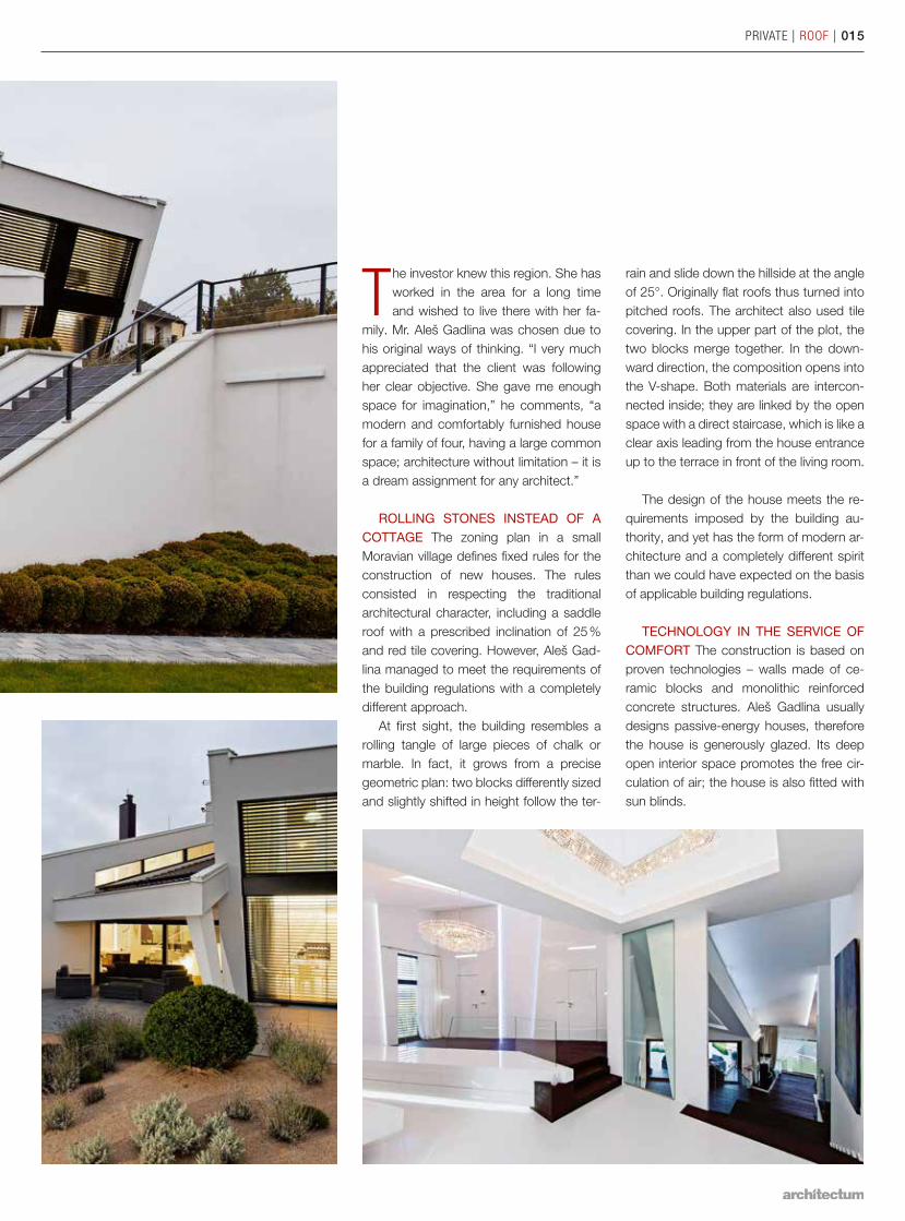
The investor knew this region. She has worked in the area for a long time and wished to live there with her fa-
mily. Mr. Aleš Gadlina was chosen due to his original ways of thinking. “I very much appreciated that the client was following her clear objective. She gave me enough space for imagination,” he comments, “a modern and comfortably furnished house for a family of four, having a large common space; architecture without limitation – it is a dream assignment for any architect.”
ROLLING STONES INSTEAD OF A COTTAGE The zoning plan in a small Moravian village defines fixed rules for the construction of new houses. The rules consisted in respecting the traditional archi tectural character, including a saddle roof with a prescribed inclination of 25 % and red tile covering. However, Aleš Gad-lina managed to meet the requirements of the building regulations with a completely different approach.
At first sight, the building resembles a rolling tangle of large pieces of chalk or marble. In fact, it grows from a precise geometric plan: two blocks differently sized and slightly shifted in height follow the ter-
rain and slide down the hillside at the angle of 25°. Originally flat roofs thus turned into pitched roofs. The architect also used tile covering. In the upper part of the plot, the two blocks merge together. In the down-ward direction, the composition opens into the V-shape. Both materials are intercon-nected inside; they are linked by the open space with a direct staircase, which is like a clear axis leading from the house entrance up to the terrace in front of the living room.
The design of the house meets the re-quirements imposed by the building au-thority, and yet has the form of modern ar-chitecture and a completely different spirit than we could have expected on the basis of applicable building regulations.
TECHNOLOGY IN THE SERVICE OF COMFORT The construction is based on proven technologies – walls made of ce-ramic blocks and monolithic reinforced concrete structures. Aleš Gadlina usually designs passive-energy houses, therefore the house is generously glazed. Its deep open interior space promotes the free cir-culation of air; the house is also fitted with sun blinds.
PRIVATE | ROOF | 015
016 | ROOF | BELGIUM
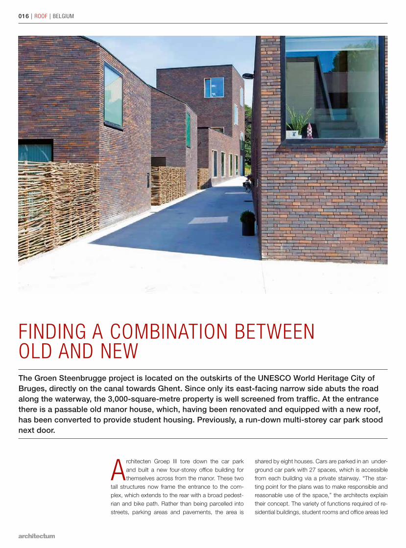
FINDING A COMBINATION BETWEEN OLD AND NEWThe Groen Steenbrugge project is located on the outskirts of the UNESCO World Heritage City of Bruges, directly on the canal towards Ghent. Since only its east-facing narrow side abuts the road along the waterway, the 3,000-square-metre property is well screened from traffic. At the entrance there is a passable old manor house, which, having been renovated and equipped with a new roof, has been converted to provide student housing. Previously, a run-down multi-storey car park stood next door.
Architecten Groep III tore down the car park and built a new four-storey office building for themselves across from the manor. These two
tall structures now frame the entrance to the com-plex, which extends to the rear with a broad pedest-rian and bike path. Rather than being parcelled into streets, parking areas and pavements, the area is
shared by eight houses. Cars are parked in an under-ground car park with 27 spaces, which is accessible from each building via a private stairway. “The star-ting point for the plans was to make responsible and reasonable use of the space,” the architects explain their concept. The variety of functions required of re-sidential buildings, student rooms and office areas led
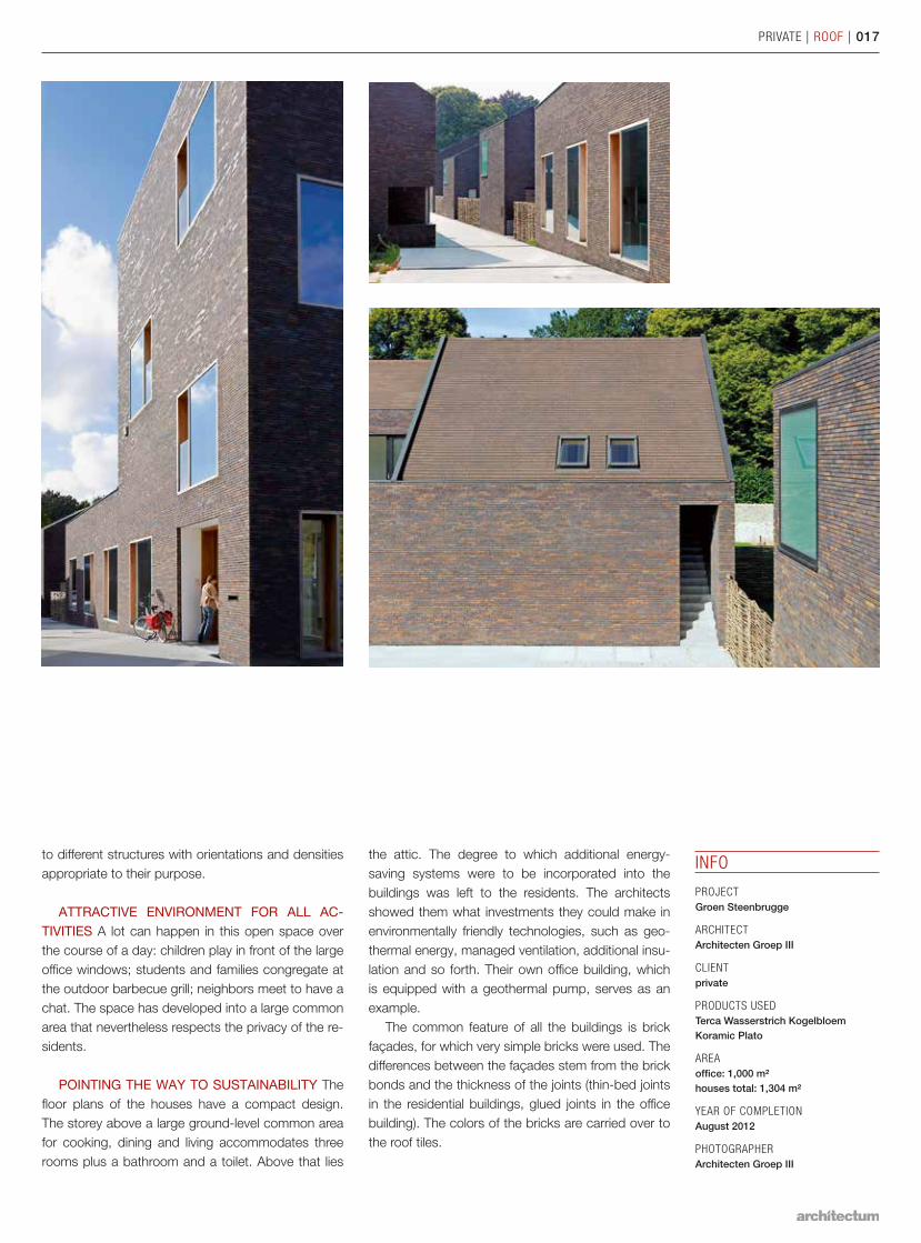
PRIVATE | ROOF | 017
to dif ferent structures with orientations and densities appropriate to their purpose.
ATTRACTIVE ENVIRONMENT FOR ALL AC-TIVITIES A lot can happen in this open space over the course of a day: children play in front of the large office windows; students and families congregate at the outdoor barbecue grill; neighbors meet to have a chat. The space has developed into a large common area that nevertheless respects the privacy of the re-sidents.
POINTING THE WAY TO SUSTAIN ABILITY The floor plans of the houses have a compact design. The storey above a large ground-level common area for cooking, dining and living accommodates three rooms plus a bathroom and a toilet. Above that lies
the attic. The degree to which additional energy- saving systems were to be incorporated into the build ings was left to the residents. The architects showed them what investments they could make in environmentally friendly technologies, such as geo-thermal energy, managed ventilation, additional insu-lation and so forth. Their own office building, which is equipped with a geothermal pump, serves as an example.
The common feature of all the buildings is brick façades, for which very simple bricks were used. The differences between the façades stem from the brick bonds and the thickness of the joints (thin-bed joints in the residential buildings, glued joints in the office building). The colors of the bricks are carried over to the roof tiles.
INFO
PROJECT Groen Steenbrugge
ARCHITECTArchitecten Groep III
CLIENTprivate
PRODUCTS USEDTerca Wasserstrich Kogelbloem Koramic Plato
AREAoffice: 1,000 m² houses total: 1,304 m²
YEAR OF COMPLETIONAugust 2012
PHOTOGRAPHERArchitecten Groep III
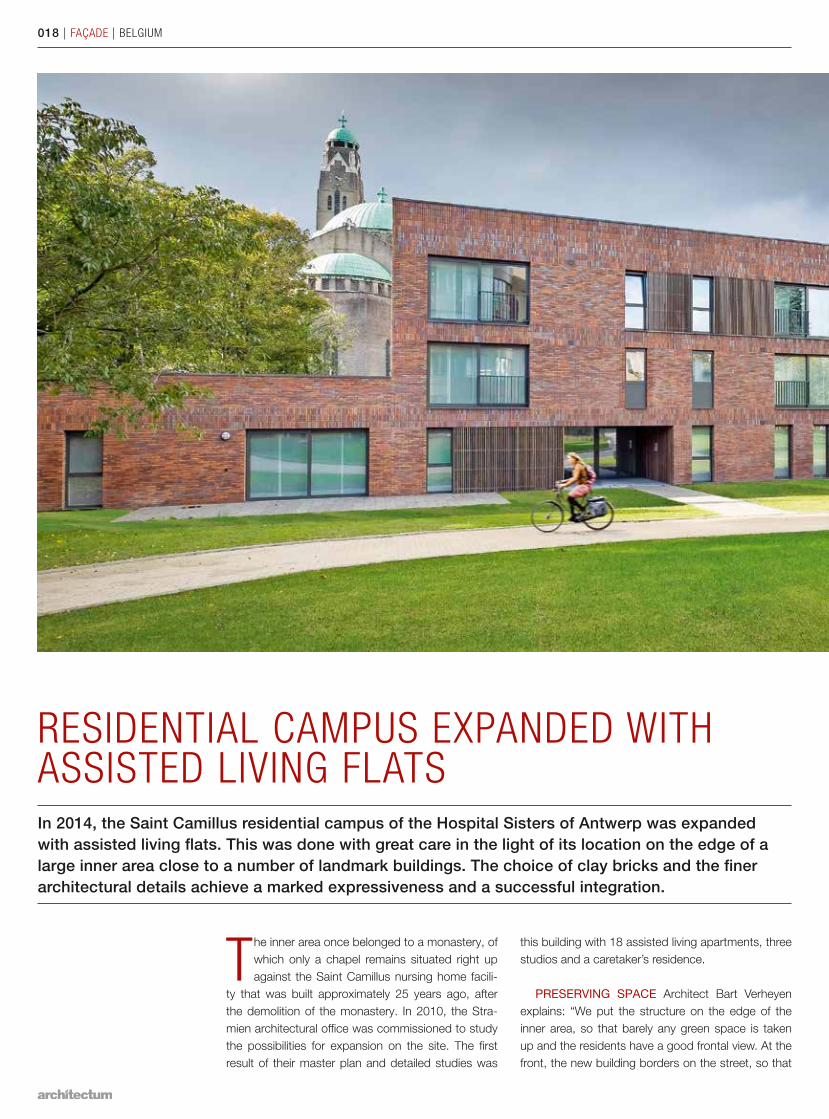
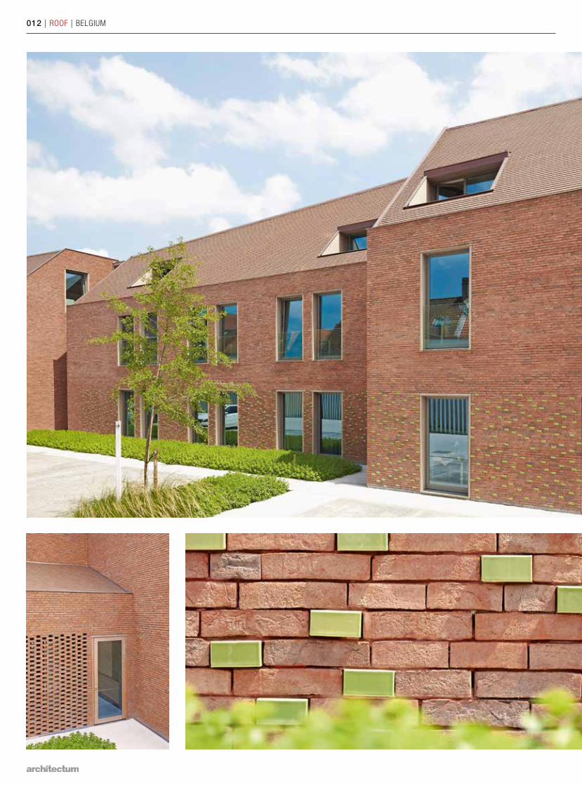
RESIDENTIAL CAMPUS EXPANDED WITH ASSISTED LIVING FLATSIn 2014, the Saint Camillus residential campus of the Hospital Sisters of Antwerp was expanded with assisted living flats. This was done with great care in the light of its location on the edge of a large inner area close to a number of landmark buildings. The choice of clay bricks and the finer architectural details achieve a marked expressiveness and a successful integration.
The inner area once belonged to a monastery, of which only a chapel remains situated right up against the Saint Camillus nursing home facili-
ty that was built approximately 25 years ago, after the demolition of the monastery. In 2010, the Stra-mien architectural office was commissioned to study the possibilities for expansion on the site. The first result of their master plan and detailed studies was
this build ing with 18 assisted living apartments, three studios and a caretaker’s residence.
PRESERVING SPACE Architect Bart Verheyen explains: “We put the structure on the edge of the inner area, so that barely any green space is taken up and the residents have a good frontal view. At the front, the new building borders on the street, so that
018 | FAÇADE | BELGIUM
its care function is both literally and symbolically em-bedded into the area. The side wall leads residents and visitors into the inner area.”
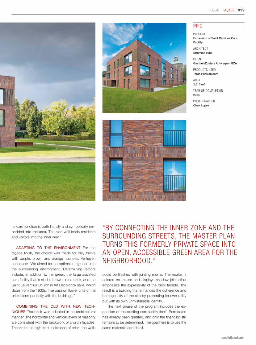
ADAPTING TO THE ENVIRONMENT For the façade finish, the choice was made for clay bricks with purple, brown and orange nuances. Verheyen continues: “We aimed for an optimal integration into the surrounding environment. Determining factors include, in addition to the green, the large assisted care facility that is clad in brown tinted brick, and the Saint Laurentius Church in Art Deco brick style, which dates from the 1930s. The passion flower tints of the brick blend perfectly with the buildings.”
COMBINING THE OLD WITH NEW TECH-NIQUES The brick was adapted in an architectural manner. The horizontal and vertical layers of masonry are consistent with the brickwork of church façades. Thanks to the high frost resistance of brick, the walls
INFO
PROJECT Expansion of Saint Camillus Care Facility
ARCHITECTStramien cvba
CLIENTGasthuisZusters Antwerpen GZA
PRODUCTS USEDTerca Passiebloem
AREA2,610 m²
YEAR OF COMPLETION2014
PHOTOGRAPHERChak Lopez
PUBLIC | FAÇADE | 019
“BY CONNECTING THE INNER ZONE AND THE SURROUNDING STREETS, THE MASTER PLAN TURNS THIS FORMERLY PRIVATE SPACE INTO AN OPEN, ACCESSIBLE GREEN AREA FOR THE NEIGHBORHOOD.”
could be finished with jointing mortar. The mortar is colored en masse and displays shadow joints that emphasize the expressivity of the brick façade. The result is a building that enhances the coherence and homogeneity of the site by presenting its own utility but with its own unmistakable identity.
The next phase of the program includes the ex-pansion of the existing care facility itself. Permission has already been granted, and only the financing still remains to be determined. The goal here is to use the same materials and detail.
020 | FAÇADE | FRANCE
PUBLIC | FAÇADE | 021
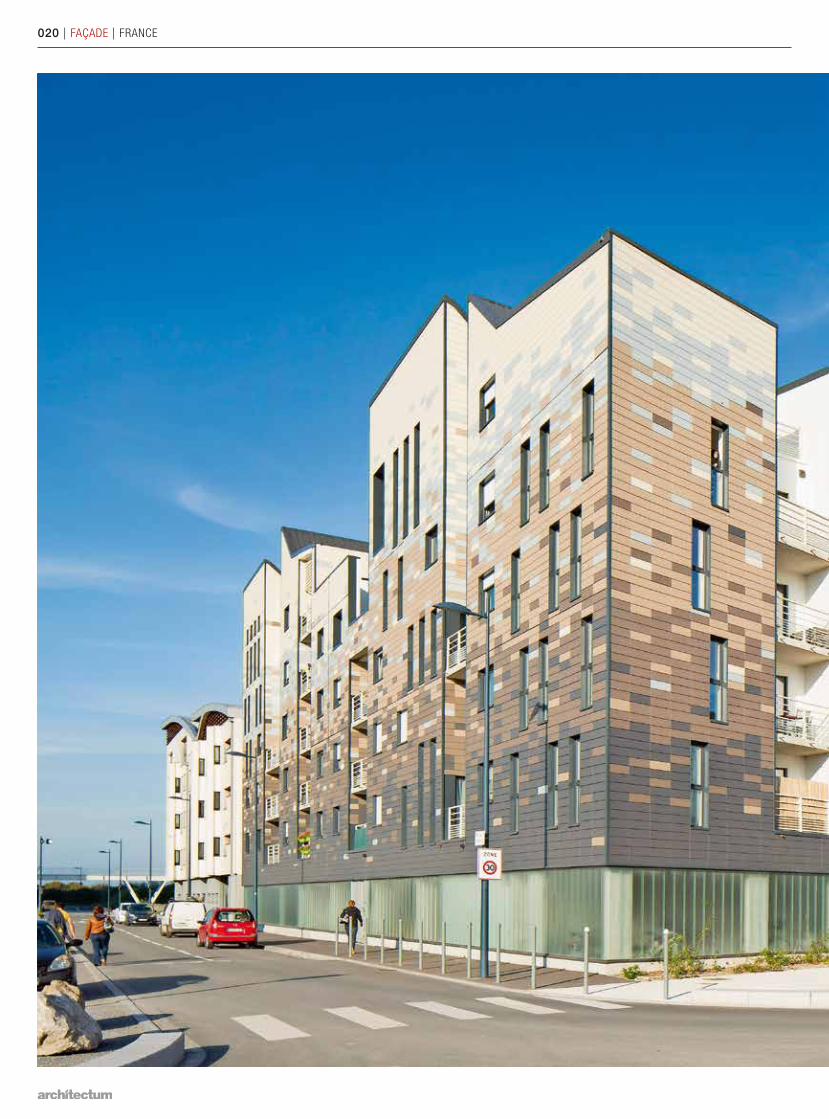
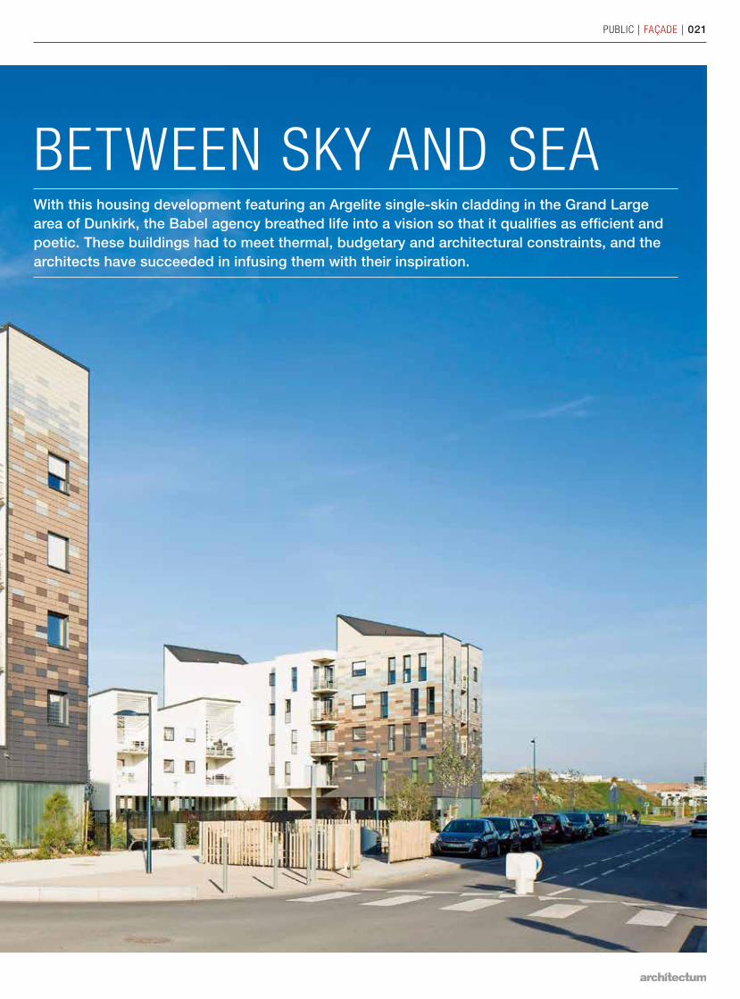
BETWEEN SKY AND SEAWith this housing development featuring an Argelite single-skin cladding in the Grand Large area of Dunkirk, the Babel agency breathed life into a vision so that it qualifies as efficient and poetic. These buildings had to meet thermal, budgetary and architectural constraints, and the architects have succeeded in infusing them with their inspiration.
022 | FAÇADE | FRANCE
PUBLIC | FAÇADE | 023
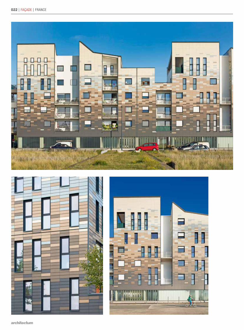
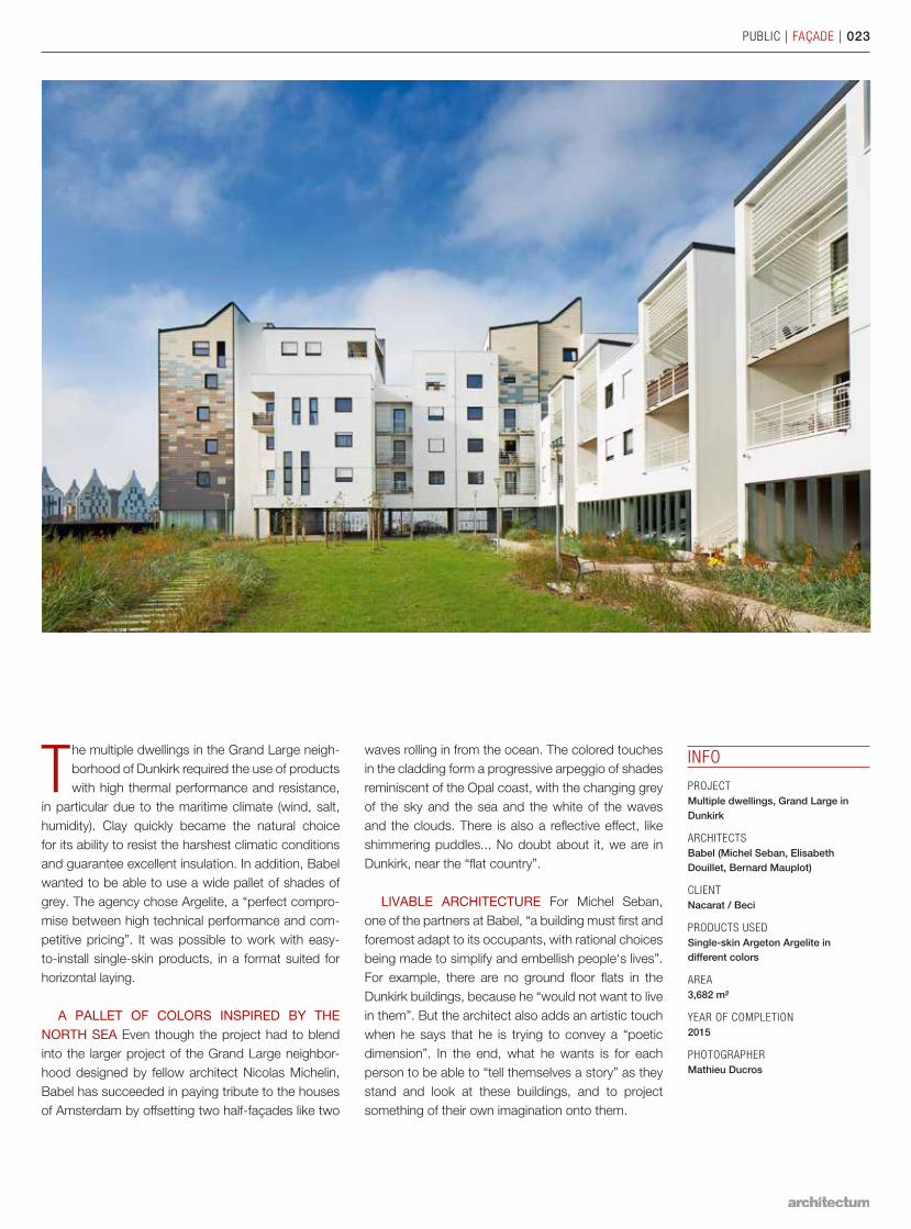
The multiple dwellings in the Grand Large neigh-borhood of Dunkirk required the use of products with high thermal performance and resistance,
in particular due to the maritime climate (wind, salt, humidity). Clay quickly became the natural choice for its ability to resist the harshest climatic conditions and guarantee excellent insulation. In addition, Babel wanted to be able to use a wide pallet of shades of grey. The agency chose Argelite, a “perfect compro-mise between high technical performance and com-petitive pricing”. It was possible to work with easy-to-install single-skin products, in a format suited for horizontal laying.
A PALLET OF COLORS INSPIRED BY THE NORTH SEA Even though the project had to blend into the larger project of the Grand Large neighbor-hood designed by fellow architect Nicolas Michelin, Babel has succeeded in paying tribute to the houses of Amsterdam by offsetting two half-façades like two
waves rolling in from the ocean. The colored touches in the cladding form a progressive arpeggio of shades reminiscent of the Opal coast, with the changing grey of the sky and the sea and the white of the waves and the clouds. There is also a reflective effect, like shimmering puddles... No doubt about it, we are in Dunkirk, near the “flat country”.
LIVABLE ARCHITECTURE For Michel Seban, one of the partners at Babel, “a building must first and foremost adapt to its occupants, with rational choices being made to simplify and embellish people‘s lives”. For example, there are no ground floor flats in the Dunkirk buildings, because he “would not want to live in them”. But the architect also adds an artistic touch when he says that he is trying to convey a “poetic dimension”. In the end, what he wants is for each person to be able to “tell themselves a story” as they stand and look at these buildings, and to project something of their own imagination onto them.
INFO
PROJECT Multiple dwellings, Grand Large in Dunkirk
ARCHITECTSBabel (Michel Seban, Elisabeth Douillet, Bernard Mauplot)
CLIENTNacarat / Beci
PRODUCTS USEDSingle-skin Argeton Argelite in different colors
AREA3,682 m²
YEAR OF COMPLETION2015
PHOTOGRAPHERMathieu Ducros
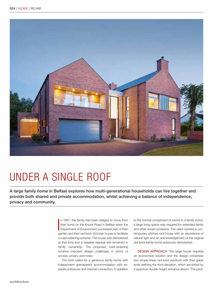
UNDER A SINGLE ROOFA large family home in Belfast explores how multi-generational households can live together and provide both shared and private accommodation, whilst achieving a balance of independence, privacy and community.
In 1991, the family had been obliged to move from their home on the Knock Road in Belfast when the Department of Environment purchased part of their
garden and their red brick Victorian house to facilitate a road-widening scheme. The house was demo lished at that time and a sizeable residual site remained in family ownership. The proposed road- widening scheme imposed design challenges in terms of access, privacy and noise.
The brief called for a generous family home with independent grandparent accommodation with se-parate entrances and internal connection. In addition
to the normal compliment of rooms in a family home, a large living space was required for extended family and other social occasions. The client wanted a con-temporary pitched roof house with an abundance of natural light and an acknowledgement of the original red brick family home previously demolished.
DESIGN APPROACH This large house required an economical solution and the design comprises two simple linear red brick pavilions with their gable ends defining the front elevation, which are linked by a spacious double height entrance atrium. The pavil-
024 | FAÇADE | IRELAND
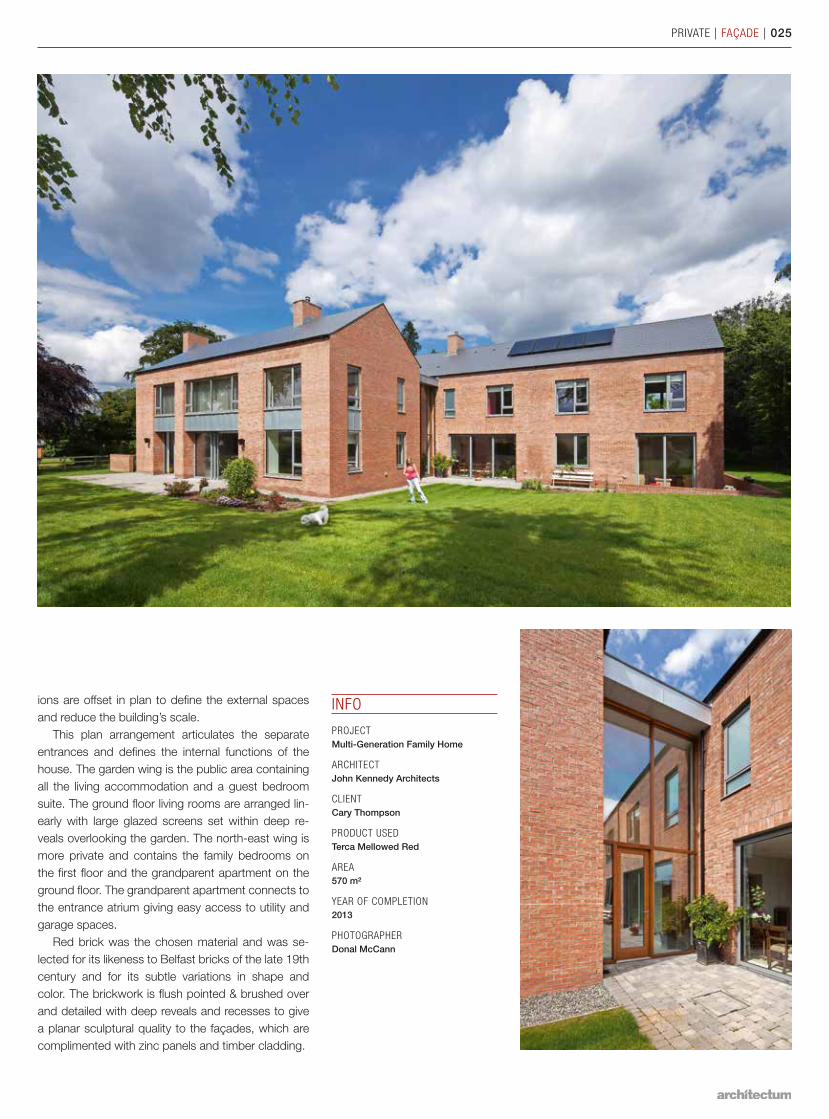
ions are offset in plan to define the external spaces and reduce the building’s scale.
This plan arrangement articulates the separate entrances and defines the internal functions of the house. The garden wing is the public area containing all the living accommodation and a guest bedroom suite. The ground floor living rooms are arranged lin-early with large glazed screens set within deep re-veals overlooking the garden. The north-east wing is more private and contains the family bedrooms on the first floor and the grandparent apartment on the ground floor. The grandparent apartment connects to the entrance atrium giving easy access to utility and garage spaces.
Red brick was the chosen material and was se-lected for its likeness to Belfast bricks of the late 19th century and for its subtle variations in shape and color. The brickwork is flush pointed & brushed over and detailed with deep reveals and recesses to give a planar sculptural quality to the façades, which are complimented with zinc panels and timber cladding.
INFO
PROJECT Multi-Generation Family Home
ARCHITECTJohn Kennedy Architects
CLIENTCary Thompson
PRODUCT USEDTerca Mellowed Red
AREA570 m²
YEAR OF COMPLETION2013
PHOTOGRAPHERDonal McCann
PRIVATE | FAÇADE | 025
026 | FAÇADE | BELGIUM
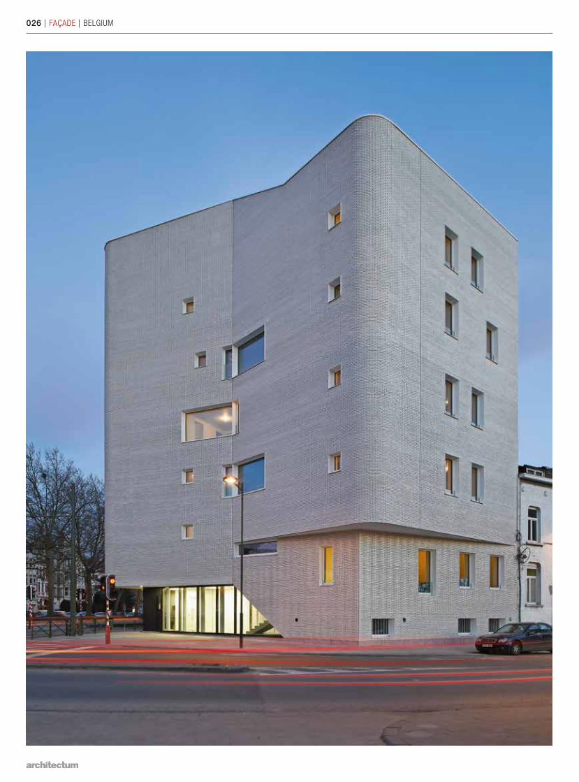
CORNER BUILDING GIVES THE NEIGHBORHOOD ITS CHARACTERIn a strategically located corner property – although one that was far from ideal as far as form and orientation are concerned – the MS-A and V+ architectural offices designed a landmark building. Their concept won an award from the Wallonia-Brussels Federation with its striking appearance, private outdoor areas, apartments bathed in natural light and respect for the public space.
The relatively small corner property with its north-ern orientation lies directly in the sightline of the Van Praetbrug, an important entrance point of
the city of Brussels. The municipality of Schaerbeek held a competition to create a concept for a building with three public housing apartments as part of a lar-ger urban renewal plan for the area. The architects of MS-A and V+ gave the jury a real surprise. Owing to the unique location and to serve as a counterweight to the high building on the other side of Lambermont Lane, they presented an even taller building with an iconic character providing room for five large apart-ments.
MORE LIVING SPACE By leaving the proper-ty partially undeveloped along the south side, the design ers created a breathing space in the inner zone and a place for south-facing facades and outdoor ter-races. A cantilever along Navez Street creates a wider sidewalk and allows the layout of a spacious entrance area. The first three floors contain the same number of split-levels apartments, which are accessible from a central stairway, with the bedrooms being situated somewhat higher along the north wall.
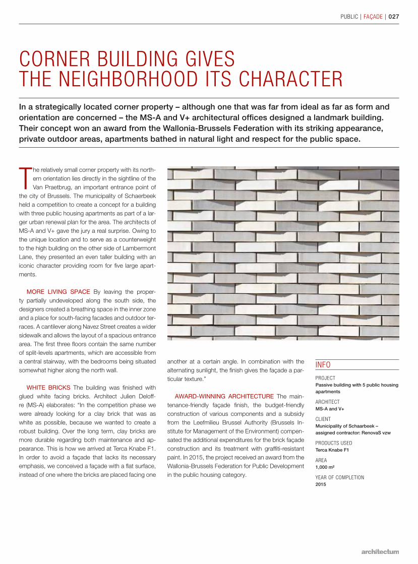
WHITE BRICKS The building was finished with glued white facing bricks. Architect Julien Deloff-re (MS-A) elaborates: “In the competition phase we were already looking for a clay brick that was as white as possible, because we wanted to create a robust build ing. Over the long term, clay bricks are more durable regarding both maintenance and ap-pearance. This is how we arrived at Terca Knabe F1. In order to avoid a façade that lacks its necessary emphasis, we conceived a façade with a flat surface, instead of one where the bricks are placed facing one
INFO
PROJECT Passive building with 5 public housing apartments
ARCHITECTMS-A and V+
CLIENTMunicipality of Schaarbeek – assigned contractor: RenovaS vzw
PRODUCTS USEDTerca Knabe F1
AREA1,000 m²
YEAR OF COMPLETION2015
PUBLIC | FAÇADE | 027
another at a certain angle. In combination with the alternating sunlight, the finish gives the façade a par-ticular texture.”
AWARD-WINNING ARCHITECTURE The main-tenance-friendly façade finish, the budget-friendly construction of various components and a subsidy from the Leefmilieu Brussel Authority (Brussels In-stitute for Management of the Environment) compen-sated the additional expenditures for the brick façade construction and its treatment with graffiti-resistant paint. In 2015, the project received an award from the Wallonia-Brussels Federation for Public Development in the public housing category.
028 | FAÇADE | UNITED KINGDOM
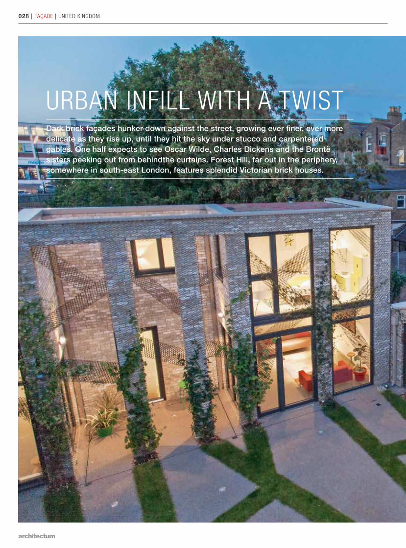
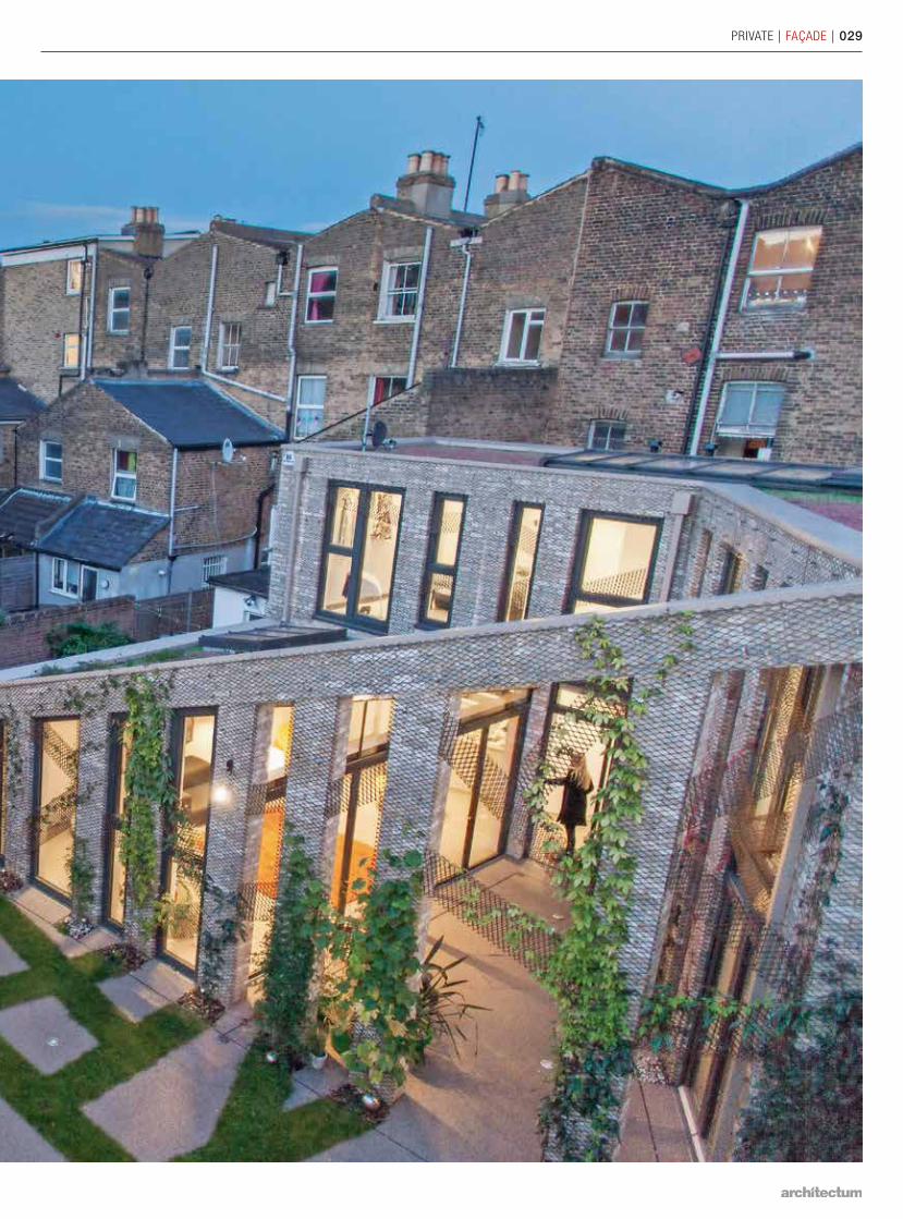
URBAN INFILL WITH A TWIST Dark brick façades hunker down against the street, growing ever finer, ever more delicate as they rise up, until they hit the sky under stucco and carpentered gables. One half expects to see Oscar Wilde, Charles Dickens and the Brontë sisters peeking out from behindthe curtains. Forest Hill, far out in the periphery, somewhere in south-east London, features splendid Victorian brick houses.
PRIVATE | FAÇADE | 029
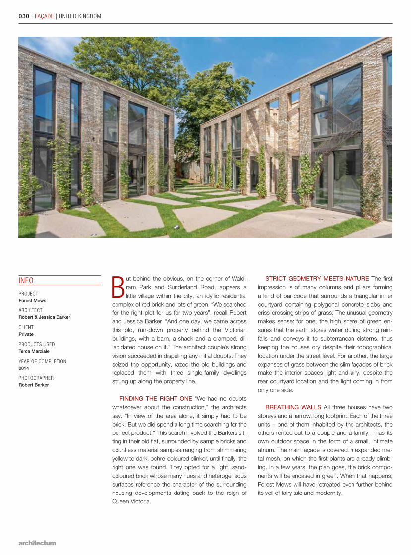
But behind the obvious, on the corner of Wald-ram Park and Sunderland Road, appears a little village within the city, an idyllic residential
complex of red brick and lots of green. “We searched for the right plot for us for two years”, recall Robert and Jessica Barker. “And one day, we came across this old, run-down property behind the Victorian buildings, with a barn, a shack and a cramped, di-lapidated house on it.” The architect couple’s strong vision succeeded in dispelling any initial doubts. They seized the opportunity, razed the old buildings and replaced them with three single-family dwellings strung up along the property line.
FINDING THE RIGHT ONE “We had no doubts whatsoever about the construction,” the architects say. “In view of the area alone, it simply had to be brick. But we did spend a long time searching for the perfect product.” This search involved the Barkers sit-ting in their old flat, surrounded by sample bricks and countless material samples ranging from shimmering yellow to dark, ochre-coloured clinker, until finally, the right one was found. They opted for a light, sand-coloured brick whose many hues and heterogeneous surfaces reference the character of the surrounding housing developments dating back to the reign of Queen Victoria.
INFO
PROJECT Forest Mews
ARCHITECTRobert & Jessica Barker
CLIENTPrivate
PRODUCTS USEDTerca Marziale
YEAR OF COMPLETION2014
PHOTOGRAPHERRobert Barker
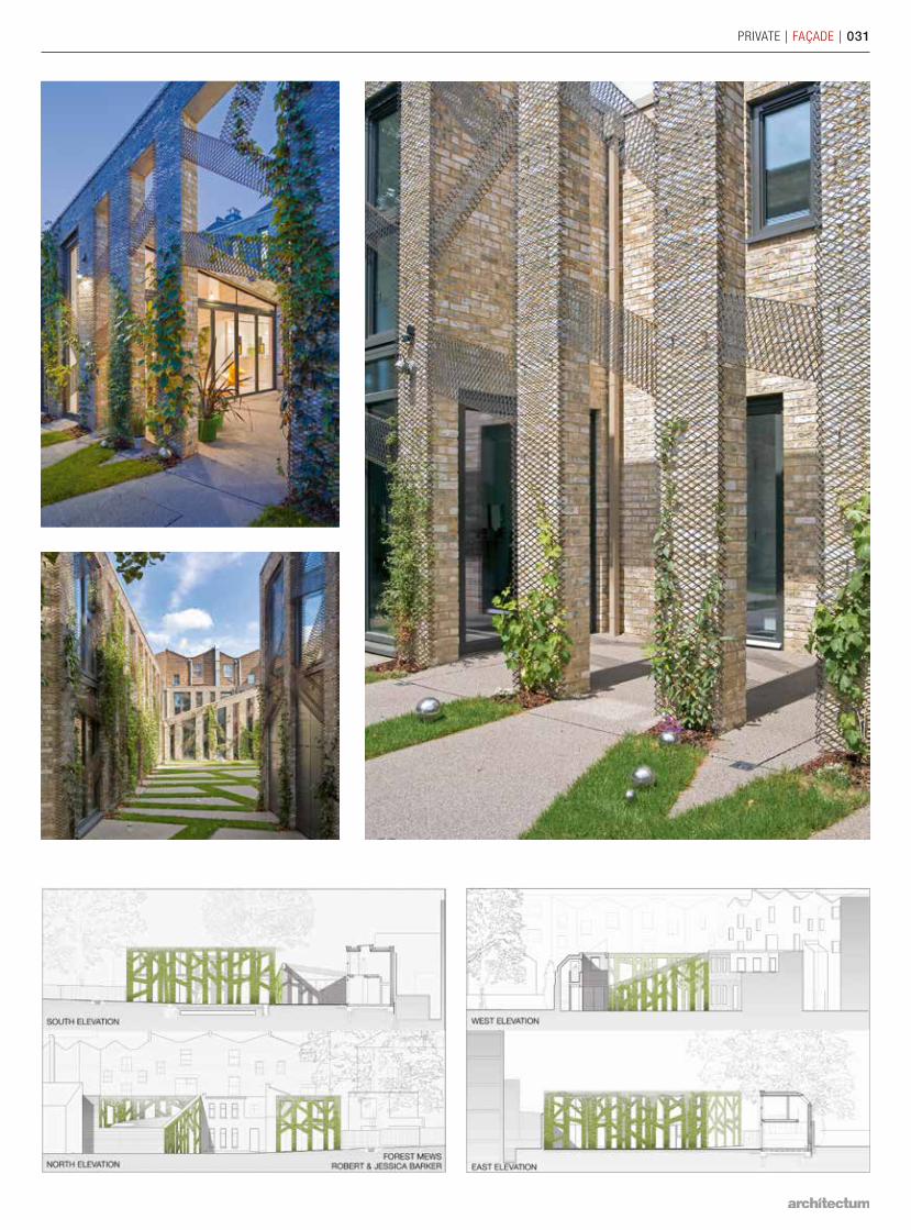
STRICT GEOMETRY MEETS NATURE The first impression is of many columns and pillars forming a kind of bar code that surrounds a triangular inner courtyard containing polygonal concrete slabs and criss-crossing strips of grass. The unusual geometry makes sense: for one, the high share of green en-sures that the earth stores water during strong rain-falls and conveys it to subterranean cisterns, thus keeping the houses dry despite their topographical location under the street level. For another, the large expanses of grass between the slim façades of brick make the interior spaces light and airy, despite the rear courtyard location and the light coming in from only one side.
BREATHING WALLS All three houses have two storeys and a narrow, long footprint. Each of the three units – one of them inhabited by the architects, the others rented out to a couple and a family – has its own outdoor space in the form of a small, intimate atri um. The main façade is covered in expanded me-tal mesh, on which the first plants are already climb-ing. In a few years, the plan goes, the brick compo-nents will be encased in green. When that happens, Forest Mews will have retreated even further behind its veil of fairy tale and modernity.
030 | FAÇADE | UNITED KINGDOM
PRIVATE | FAÇADE | 031
032 | FAÇADE | GERMANY
PRIVATE | FAÇADE | 033
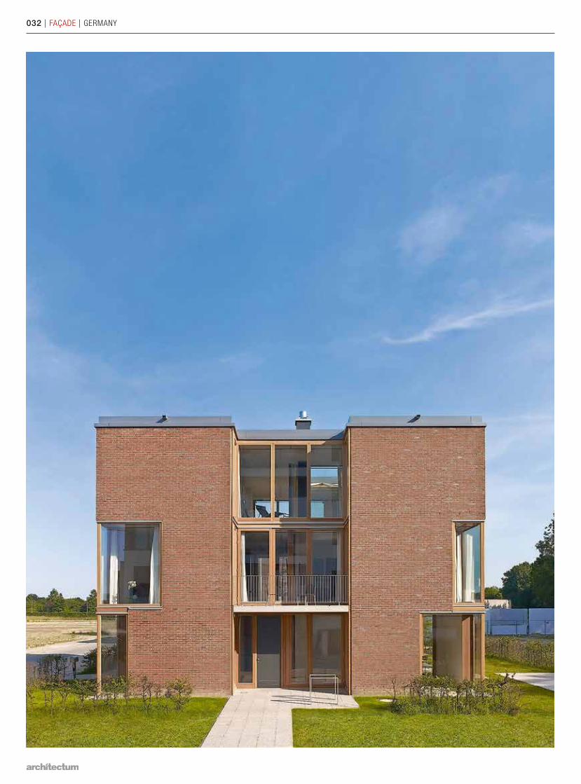
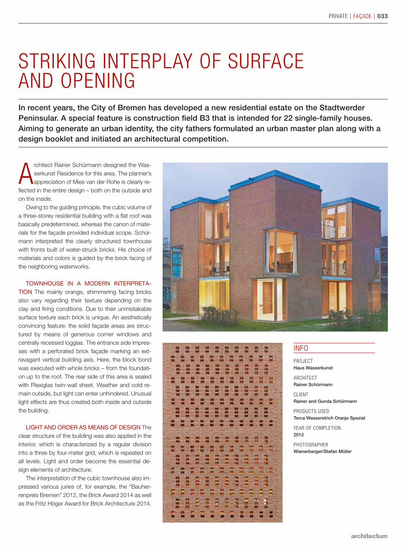
STRIKING INTERPLAY OF SURFACE AND OPENINGIn recent years, the City of Bremen has developed a new residential estate on the Stadtwerder Peninsular. A special feature is construction field B3 that is intended for 22 single-family houses. Aiming to generate an urban identity, the city fathers formulated an urban master plan along with a design booklet and initiated an architectural competition.
Architect Rainer Schürmann designed the Was-serkunst Residence for this area. The planner’s appreciation of Mies van der Rohe is clearly re-
flected in the entire design – both on the outside and on the inside.
Owing to the guiding principle, the cubic volume of a three-storey residential building with a flat roof was basically predetermined, whereas the canon of mate-rials for the façade provided individual scope. Schür-mann interpreted the clearly structured townhouse with fronts built of water-struck bricks. His choice of materials and colors is guided by the brick facing of the neighboring waterworks.
TOWNHOUSE IN A MODERN INTERPRETA-T ION The mainly orange, shimmering facing bricks also vary regarding their texture depending on the clay and firing conditions. Due to their unmistakable surface texture each brick is unique. An aesthetically convincing feature: the solid façade areas are struc-tured by means of generous corner windows and centrally recessed loggias. The entrance side impres-ses with a perforated brick façade marking an ext-ravagant vertical building axis. Here, the block bond was executed with whole bricks – from the foundati-on up to the roof. The rear side of this area is sealed with Plexiglas twin-wall sheet. Weather and cold re-main outside, but light can enter unhindered. Unusual light effects are thus created both inside and outside the building.
LIGHT AND ORDER AS MEANS OF DESIGN The clear structure of the building was also applied in the interior, which is characterized by a regular division into a three by four-meter grid, which is repeated on all levels. Light and order become the essential de-sign elements of architecture.
The interpretation of the cubic townhouse also im-pressed various juries of, for example, the “Bauher-renpreis Bremen” 2012, the Brick Award 2014 as well as the Fritz Höger Award for Brick Architecture 2014.
INFO
PROJECT Haus Wasserkunst
ARCHITECTRainer Schürmann
CLIENTRainer and Gunda Schürmann
PRODUCTS USEDTerca Wasserstrich Oranje Spezial
YEAR OF COMPLETION2012
PHOTOGRAPHERWienerberger/Stefan Müller
034 | FAÇADE | THE NETHERLANDS
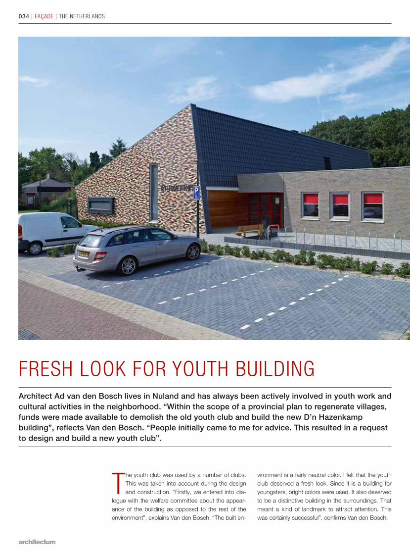
FRESH LOOK FOR YOUTH BUILDINGArchitect Ad van den Bosch lives in Nuland and has always been actively involved in youth work and cultural activities in the neighborhood. “Within the scope of a provincial plan to regenerate villages, funds were made available to demolish the old youth club and build the new D’n Hazenkamp building”, reflects Van den Bosch. “People initially came to me for advice. This resulted in a request to design and build a new youth club”.
The youth club was used by a number of clubs. This was taken into account during the design and construction. “Firstly, we entered into dia-
logue with the welfare committee about the appear-ance of the building as opposed to the rest of the environment”, explains Van den Bosch. “The built en-
vironment is a fairly neutral color. I felt that the youth club deserved a fresh look. Since it is a building for youngsters, bright colors were used. It also deserved to be a distinctive building in the surroundings. That meant a kind of landmark to attract attention. This was certainly successful”, confirms Van den Bosch.
PUBLIC | FAÇADE | 035
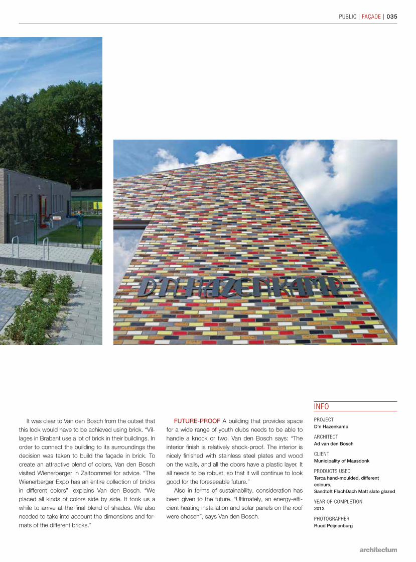
It was clear to Van den Bosch from the outset that this look would have to be achieved using brick. “Vil-lages in Brabant use a lot of brick in their buildings. In order to connect the building to its surroundings the decision was taken to build the façade in brick. To create an attractive blend of colors, Van den Bosch visited Wienerberger in Zaltbommel for advice. “The Wienerberger Expo has an entire collection of bricks in different colors”, explains Van den Bosch. “We placed all kinds of colors side by side. It took us a while to arrive at the final blend of shades. We also needed to take into account the dimensions and for-mats of the different bricks.”
FUTURE-PROOF A building that provides space for a wide range of youth clubs needs to be able to handle a knock or two. Van den Bosch says: “The interior finish is relatively shock-proof. The interior is nicely finished with stainless steel plates and wood on the walls, and all the doors have a plastic layer. It all needs to be robust, so that it will continue to look good for the foreseeable future.”
Also in terms of sustainability, consideration has been given to the future. “Ultimately, an energy-effi-cient heating installation and solar panels on the roof were chosen”, says Van den Bosch.
INFO
PROJECT D’n Hazenkamp
ARCHITECTAd van den Bosch
CLIENTMunicipality of Maasdonk
PRODUCTS USEDTerca hand-moulded, different colours, Sandtoft FlachDach Matt slate glazed
YEAR OF COMPLETION2013
PHOTOGRAPHERRuud Peijnenburg
www.architectum.com


![[Reader] Fremdenrechtsnovelle 2011: another brick in the racist wall](https://img.pdfslide.org/doc/110x75/577d2adf1a28ab4e1eaa5537/reader-fremdenrechtsnovelle-2011-another-brick-in-the-racist-wall-.jpg)